One Day at the Liverpool Biennial

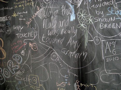
Liverpool Biennial Visitors Centre 2010 Blackboard

In the same week that the art world was shaken by the news of a hefty 29.6% funding cut in the Comprehensive Spending Review, I headed to Liverpool to check out what is undoubtedly one of the crowing jewels of the publicly-funded arts scene in the UK - the Liverpool Biennial.

The theme of this year's Biennial is Touched, and according to Festival Director Lewis Biggs, it aims to present art with 'emotional impact... that can not only gain our attention but that can move us, motivate us, allow us to find a way to change ourselves.'

My plan was to take in as many as possible of the dozens of artworks that transform the city into a vast gallery during the Biennial - both from the official Touched programme, from the Biennial Independents, and as part of all the other art projects that run alongside. How long did I have to achieve this ambitious goal? One single day - or in actual fact, about six hours. Here's how I got on:

12.30pm: Arrive at Liverpool Lime Street station about an hour later than planned, owing to some unexpected train issues requiring a detour to Wigan, though sadly no pies.

12.45pm: First stop is the Walker Art Gallery, for the John Moores Painting Prize 2010. Now in its 50th year, John Moores has a reputation for offering up a selection of the most exciting new British painting. This year's exhibition also includes works by Chinese artists entered for a new offshoot of the prize - the Shanghai John Moores Painting Prize.

There's a lot to see here, and though the works on display are a mixed bag, they raise some interesting questions about the nature of contemporary British painting. You can read my full review of the exhibition on the a-n interface website here.

1.45pm: Time to set off down Renshaw Street. Taking over the empty spaces of the city is a hallmark of the Biennial, and so its no surprise to find the windows of Rapid (an old DIY store) transformed with anti-consumerist slogans by the Freee art collective. Further on, two giggling semi-naked students pose awkwardly as real-life mannequins in the window, their skin daubed with corporate slogans, for Daniel Knorr's The Naked Corner.


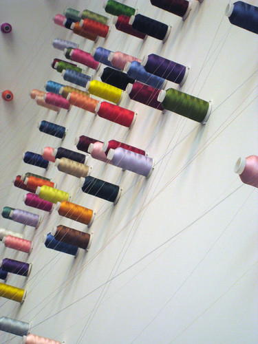
Lee Mingwei's Mending Project, Liverpool Biennial 2010

Both these works are part of Re:Thinking Trade, a strand of the Touched exhibition which also includes Lee Mingwei's The Mending Project, (above), in which visitors are asked to bring items of clothing that need mending, and keep the artist company whilst he fixes them. Rather than making the repair itself invisible, instead the process of mending is celebrated and marked with multi-coloured embroidery stitches, using the brightly-coloured threads that create a web around the space, connecting children's teddy bears with items of well-loved clothing.


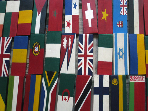
Meschac Gaba, The Souvenier Palace, Liverpool Biennial 2010


Close by, Meschac Gaba has created The Souvenir Palace (above) - a souvenir shop with a twist. Here, souvenirs are displayed alongside the accumulated detritus of everyday life, all painted in the colours of different national flags. The shop is intended to function as a trading post, so visitors to the exhibition can bring along their own personal items to be painted and swapped for those on display, in a fun riff on the commodification of national identity, and the mass production of stock souvenirs.


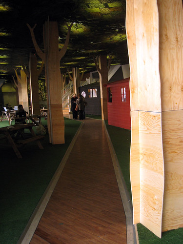
Liverpool Biennial Visitors Centre 2010

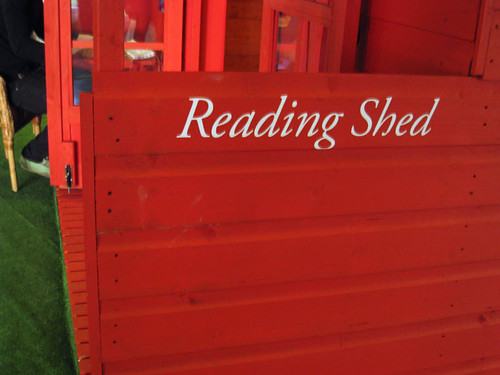
2.15pm: Also at Rapid is the Biennial Visitor's Centre (above), which transforms the disused space into a bustling faux woodland grove, dotted with sheds painted in pillar-box red (below). Blackboards provide a space for visitor feedback, as well as information about the day's events and happenings, and visitors can also explore artworks such as The Marx Lounge by Alfredo Jaar, which includes three copies of every work ever written by, or about Marx, complete with comfy sofas should you wish to peruse them.


Liverpool Biennial Visitors Centre 2010 Reading Shed

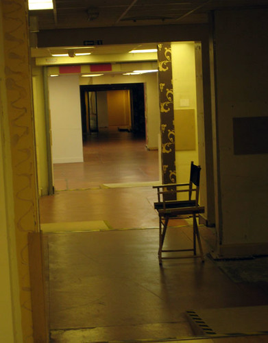
Downstairs in the basement, a labyrinth of empty, atmospheric corridors lead us to encounter Trill-Ology, a disconcerting video installation by Texan artist Ryan Trecartin, recommended to me on Twitter by @
sheshark. Here, the artist and an accompanying gaggle of shrieking, gender-bending miscreants, smeared in make-up like extras from a horror movie, perform in an extraordinarily inventive trilogy of garish video pieces - a relentless, hectic mashup of plane crashes, LA-style pool parties, soliloquies, hissy-fits and stripteases that play out like a reality TV show on acid, creating an uncanny contrast with the silent spaces of the Rapid basement.

52 Renshaw Street, Liverpool Biennial 2010


3.30pm:
After a quick pitstop for lunch (an essential item on the agenda), it's time to head onwards to the Anglican cathedral, where the Oratory is playing host to The Temple of a Thousand Bells, a installation by Brazilian artist Laura Belém, recommended to me as a highlight of the 2010 Biennial by @alistairbeech.

The chilly white space of the Oratory is the perfect venue for this ethereal installation in which glass bells are suspended invisibly from the ceiling, alongside a haunting soundtrack of music and the legend of an island temple that sinks beneath the sea.

Laura Belem, Temple of a Thousand Bells, Liverpool Biennial 2010

4.00pm: Next stop is FACT, but en route we spot a wolf (the distinctive logo for this year's Biennial, created by Carlos Amorales) and make a detour into 106 Wood Street, an empty garage that has been transformed by Raymond Pettibon into a 'mixed-media environment' incorporating the animation Sunday Night and Saturday Morning (2005), as well as wall-drawings alongside pre-existing graffiti.

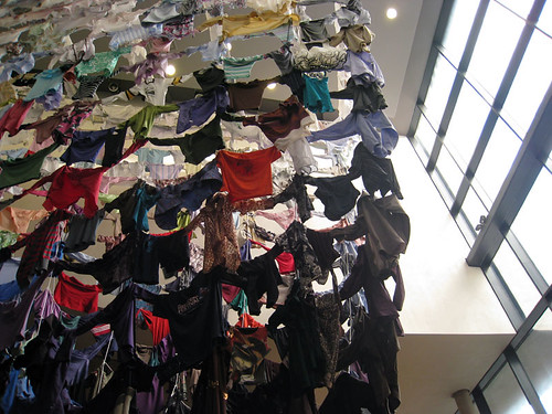
4.20pm: On to FACT, where artwork by Finnish artist Karinaa Kaikkonen has taken over the foyer space. For Hanging On to Each Other (below), Kaikkonen collected second-hand clothing from people all over Liverpool to create a colourful washing-line style installation.

Hanging On to Each Other, Kaarina Kaikkonen at FACT, Liverpool Biennial 2010

In the gallery spaces themselves, Yves Netzhammer's Dialogical Abrasion is an uncanny, alienating experience: an installation with jarring sound and lighting effects, creating a fractured and uncomfortable environment.

Meanwhile, Tehching Hsieh’s One Year Performance 1980 – 1981 (Time Clock Piece) is an incredibly intriguing recreation of the artists original performance piece, in which he took a photograph of himself every hour, on the hour, every day for a year. Although the work on display here is merely documentation of the performance itself, there is something fascinating about contemplating the thousands of images and time clock punch cards Hsieh created over the course of the year, which completely cover the walls of the gallery.

5.00pm: At the Bluecoat, where we pause in the café for much needed tea and contemplate the (empty) Bed-In, a recreation of John and Yoko’s famous 1969 peace protest, which is hosting a new action by performers, artists and others each day.

Next up are the galleries themselves, where we encounter Daniel Bozhkov's recreation of the Liverpool FC dressing rooms for his installation Music Not Good For Pigeons and Ranjani Shettar's understated installation for the Vide.

My favourite work here, however, has to be Nicholas Hlobo's Ndize, a playful installation that leads visitors through a maze of brightly coloured, densely hanging ribbons that hang from the floor to the ceiling. Part sinister funfair, part innocent game of hide-and-seek, this is a genuinely disorientating and entertaining experience - the perfect end to our Biennial odyssey.


6.00pm: It's time to head home. There's so much more I wish I'd had chance to see... Do-So Huh's
Korean House, more Touched offerings at Tate Liverpool and in the public spaces of the city, Bloomberg New Contemporaries at A Foundation, not to mention some of the many events and 'happenings' that have been taking place throughout the Biennial period... but there's only so much art you can realistically fit into one day, or in fact a mere six hours.

Final thoughts on this year's Biennial? There's an incredible range of work here, but for me, what makes it extra-special is the way we encounter it in unexpected places and spaces across the city. Perhaps that's why during the Biennial, Liverpool feels more like a playground than a conventional art gallery, full of idiosyncratic and exciting artworks to discover and engage with. Much of it is baffling, but some of it is brilliant; for me at least, the final word has to go to Adrian Searle, in his review of the Biennial for the Guardian: ‘There are things I do not understand – but sometimes this doesn’t matter.’

So did you visit this year's Biennial? What did you think of it - and what were your highlights?

Ai Weiwei at Tate Modern

Seeds

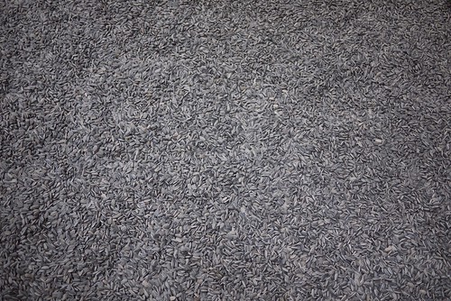
Ai Weiwei's new Tate Modern Turbine Hall installation, Sunflower Seeds, is made up of millions of what appear to be sunflower seed husks, but are in fact intricately hand-crafted porcelain imitations. Each seed has been painstakingly sculpted and painted by skilled craftspeople working in small-scale workshops in Jingdezhen, China, before being brought together in this work which explicitly invites us to think more deeply about what it means for something to be 'Made in China' and the related notions of import and export, and cultural or economic exchange.
The artist's original intention for the piece was that the audience would be able to walk across the expanse of seeds, to sit down amongst them, to pick them up and to look at them closely. However, Tate visitors have now been stopped from walking over the seeds because of health and safety concerns: the fear is that Tate staff might be at risk of respiratory problems from continued exposure to the dust created as people walked over them.
Visitors can still look at the seeds from a distance, but there's no doubt that this radically changes the artwork itself. The question is, is this even the same artwork if we can't interact with it in the way the artist intended?

Weiwei is said to be 'disappointed' by the decision, and when I visited, I felt disappointed too. The individual seeds are beautiful in their own right, and the overall vista is pleasingly minimal, but the installation as a whole now feels about as engaging as a large-scale gravel drive. For me, the best thing about the installation was the trail of ghostly footprints across the surface of the sunflower seeds, almost like tracks through snow. They acted as a little reminder that there is more to this artwork than we, for now at least, are able to experience.

[image by SimonDoggett used via Creative Commons]

Street Art: more than meets the eye?

Although living in central London, I’m confronted by a Banksy on practically every corner, I have to admit that I don’t know much about the world of street art. Although I appreciate the sense of humour that's evident in the work of graffiti artists, even when I was running a visual art bookshop a few years back, I was never especially drawn to the (increasingly massive numbers of) books on street art and graffiti. Compared to the lovely books on illustration, fashion, graphic design, craft or contemporary art that always immediately grabbed my attention, street art always seemed hard-edged, aggressive, masculine and also somehow banal. In fact I might have been tempted to agree with art critic Ben Ward, who argued in a debate at Tate Modern in 2008 that street art is actually just a bit boring.

Recently though, I was intrigued to discover (through a feature in Stylist magazine of all places) the work of a whole new group of female artists, such as Claw Money, Miss Van, Koralie and Neozoon, who are creating street art of a very different kind. There's a huge variety here, and it's certainly far from boring: whilst Koralie toys with Japanese culture and the Manga tradition; Miss Van (see above) creates soft-focus images that question conventional notions of feminity; and my personal favourite, the collective Neozoon swap traditional paint for fur, transforming cast-off fur jackets into idiosyncratic street pieces, and even installing cages of ‘fur coat animals’ in German zoos. Reading more about the work these artists are creating, it was clear that I’d been a little too quick to pigeonhole street art.

In a moment of synchronicity, publisher Laurence King chose the same week to send me a couple of their newest titles on the subject of street art, giving me the perfect opportunity to find out more.


The Street Art Stencil Book is a celebration of the art of the stencil, bringing together images and useable stencils from street artists who range from the big names that even I'm familiar with, such as Blek Le Rat, through to emerging new talents in the field from around the world. Seeing the sheer range of artwork here - from London artist Eine's work with with old-fashioned lettering, through to Barcelona collective BToy's nostalgic and haunting images of iconic women from the past - and indeed the occasional skateboarding gnome - confirmed my growing suspicion that there is more to street art than immediately meets the eye.


Meanwhile, the Street Art Doodle Book by Dave the Chimp aims to be a colouring book with a difference, with images like the one above from a whole range of street artists and illustrators, from Jon Burgerman to Pure Evil, to colour and customise. Of course, we’ve seen this kind of thing before in books like Taro Gomi’s series of Doodle Books, or even in the Jake and Dinos Chapman colouring books currently on display at the Whitechapel; however I do like the anarchic twist that Dave the Chimp brings to the colouring book context. Declaring that ‘colouring books are boring’, he advocates breaking the rules, colouring outside the line, and ‘making the world a more colourful place’. Keri Smith would be proud.

Clearly, I couldn’t resist having a go myself. Who would have thought that I’d end in creating my own work of street art, even if it is on paper rather than an, um, street? Still, I don't think Banksy has much to worry about.

[Graffiti by Miss Van and Ciou, Barcelona: photo by aikijuanma used under Creative Commons. Book cover and spread via Laurence King]

The Bookseller Children's Conference 2010


Take a look at this new blog post I wrote for the Booktrust blog about this year's Bookseller Children's Conference, exploring digital publishing...

London Art Book Fair 2010

Last weekend I headed to The Whitechapel Art Gallery for two of my favourite things in one – art and books together at the London Art Book Fair.

This annual event devoted to international art publishing showcases books by everyone from the big players (Tate, Thames & Hudson, Phaidon and co.) through to quirky independent zines, gallery publications, self-publishing projects and beautiful one-off books created by artists. This year’s fair was also accompanied by a whole host of book related activities, ranging from book signings with artists like Martin Creed and Bob & Roberta Smith, to workshops on creative writing and artist books, to talks on subjects like self-publishing and e-zines.

As someone who is endlessly fascinated by all books, but in particular by the idiosyncracy, individuality, tactile loveliness and sheer good fun of DIY publishing, I have to admit that for me, going to the London Art Book Fair is a bit like going to a sweet shop. Here are a few favourites that caught my eye:

The Whitechapel has its own range of publications, including exhibition catalogues and artist publications like The Jake and Dinos Chapman Colouring Book. However, I’m a particular fan of their Documents of Contemporary Art Series, which bring together a rigorous selection of writings and theoretical texts on a particular topic – be it Participation, The Archive or The Artist’s Joke. Although they ostensibly have a focus on contemporary art theory, there are texts by all kinds of theorists and cultural commentators here, and titles like The Gothic and The Sublime are definitely relevant to a wider audience.


Art of McSweeney
’s was the title that instantly grabbed my attention at the Tate Publishing stand. With a dust-jacket that folds out into a double-sided poster, copious illustrations and contributions from collaborators including Michael Chabon, Daniel Clowes, Robert Crumb, Marcel Dzama, Joyce Carol Oates and Chris Ware, this is a rich and beautifully presented book in the true McSweeney’s tradition. You can watch a short video about the book here:


Tate also publish an interesting selection of illustrated children's books, which true to form, I find it difficult to resist. I love Around the World With Mouk, which follows the international adventures of a cute globe-trotting bear, and one of my most recent acquisitions is Counting Birds, a charmingly illustrated picture book by Alice Melvin, with lovely spreads like this:


Amongst their children's titles at the book fair, I also took a fancy to their new Art Collector game – a variation on the traditional Happy Families-style card game, where children can aquire, collect and trade famous works of art from Warhol to Whistler. Perfect practice for the Charles Saatchis of the future. And I was immediately drawn to Big-Top Benn by David McKee: first published forty years ago, this is the original story of Mr Benn, who here swaps his bowler hat for a clown costume and is transported into the colourful world of the circus. More lovely, evocative spreads to enjoy:


Black Dog Publishing are a relative newcomer on the publishing scene, but have already published an impressive range of intriguing illustrated books about art, architecture and contemporary culture. I have to admit to being a little disappointed by their recent book Illustrated Children’s Books (though I admit when it comes to children’s books I am probably hard to please) but I enjoyed a good flick through a new title, Alphabets: A Miscellany of Letters by David Sacks.

Four Corners Familiars
is a series of titles from Four Corners Books that particularly appeals to me. Artists are invented to respond to classic novels and short stories, resulting in some very different kinds of reading experiences. The Picture of Dorian Grey with art by Gareth Jones reimagines the story as a costume drama set in 1970s Paris in a large-format edition that returns to the story’s original origins in a magazine; whilst James Pyman presents Dracula in a series of different typefaces based on those used at the time of the novel’s publication; and Donald Urqhart gives Becky Sharp a 1930s Hollywood feel in Vanity Fair.


Amongst the individual artists and designers whose work was on display, I loved graphic designer and illustrator Kaho Kojima’s quirky printed books and pop-ups. Chisato Tambayashi also uses pop-ups and paper cutting techniques in a series of beautiful books and cards like these:
One of my favourite new discoveries at the fair was Lovely Daze, a curatorial journal that is published biannually. The journal aspires to provide a platform for artists to present their writings and artworks, and each one has a different topic or theme, ranging from ‘a day in New York when nothing happens’ through to ‘Numbers’. My favourite, however, was a special edition recipe book by pastry chef Angela Garcia, accompanied by incredibly beautiful paintings by Cristina Roduriguez, on the theme of ‘A rose is a rose is a rose is a rose’. What could be better than yummy paintings and recipes?


Finally, for anyone at all interested in reading more about art books, zines and artist publications, I heartily recommend the wonderful blog Book By Its Cover - a treasure trove of lovely books to discover and explore.

[All images from publisher websites unless otherwise specified]