play the shape game


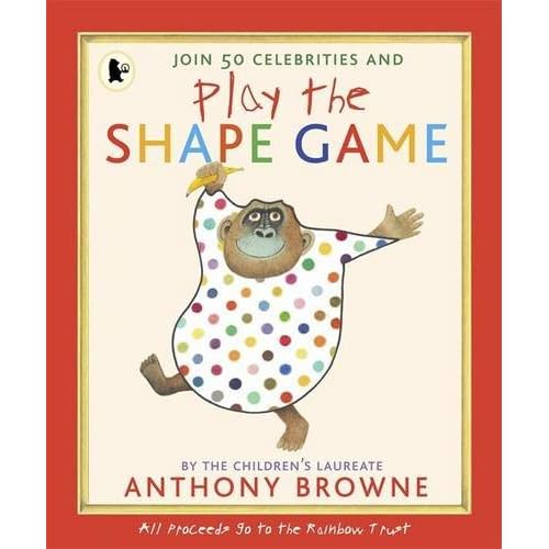
So this is what's been keeping me so busy recently that I've had little time for writing. The Shape Game project is something I've been working on as part of my work with the Children's Laureate Anthony Browne, and this new book (above) was launched on Monday.

If you haven't heard of the Shape Game before, it's basically a collaborative drawing game. Anthony Browne explains it as follows:
'The rules of the Shape Game are very simple: the first player quickly draws any abstract shape at random, the second looks at it and then transforms it into something recognisable. It could be anything – a face, a dinosaur or a fried egg. It could be a doodle or a work of art.

'When we were children, my brother Michael and I thought this game was our invention, but having spoken to children all over the world, I have since discovered that children everywhere know it and play their own versions. The wonderful thing about the Shape Game is that anyone with a little bit of imagination can join in.

'As Children’s Laureate, I want to help and connect with children everywhere, and encourage them to use their imaginations and be creative. Although it’s just a simple game, I believe the Shape Game is the perfect way to do this. It encapsulates the act of creativity – inspiration is everywhere. I have played the Shape Game in every single book I have made, and now you have the chance to join in and play it, too!'
As part of the project, 45 writers, artists, illustrators and celebrities - ranging from Quentin Blake and Shirley Hughes to Emma Thompson and Harry Hill - joined Anthony to play the game, transforming a shape he drew. You can see some of my favourites amongst the artworks below or look at a gallery on the Guardian website here. All the artworks have been published in the new Play the Shape Game book which we have been working on with the wonderful Walker Books, and which aims to help all children to be creative and use their imaginations. They're also for sale until Sunday in an online auction.

Profits from the book and auction will be donated to children's charity Rainbow Trust, who provide vital emotional and practical support to families who have a child with a life-threatening or terminal illness. You can find loads more about the project on the Children's Laureate website here.


Quentin Blake

Shirley Hughes


Jan Pienkowski

Sir Peter Blake


Shoreditch Festival


The idea of the traditional summer 'village fete' - which I remember well from childhood summers in an actual village - seems to have been well and truly reclaimed by London's hipsters. Summer in London is replete with ironic village fetes, complete with everything from bunting to tombolas to home-made cakes, from the Innocent Village Fete in Regent's Park to the V&A's annual Summer Fete.

So it was with this weekend's Shoreditch Festival, which saw the usually somewhat dingy space of Shoreditch Park transformed into a multi-coloured extravaganza of fun - yet pleasingly, this free, family-friendly festival didn't overdo the irony, and so managed to retain some of the good-natured community atmosphere of a real, old-fashioned summer fete, albeit one reinvented for an urban East London audience, complete with jazzy pigeon-themed branding.

Some of my highlights from my afternoon stroll around the festival grounds were: lemon-yellow cupcakes and tea; Buster Keaton films on the big screen; children's books (what else?) on sale from the excellent Victoria Park bookshop; guinea pigs, rabbits and chickens courtesy of Hackney City Farm; children bouncing on huge cushions on the Spoken Word tent, in between playing drawing games with Children's Laureate Anthony Browne; Mr Wonderful's Tea Dance; and especially the ace Shoreditch Bark Dog Show which featured some exceptionally cute dogs completing for titles such as Most Glamorous, and Best Tail-Wagging. (Now I bet that's something that wasn't on the line up at ATP or Latitude...)

[Image via Shoreditch Festival]

There's Nuffin Like a Puffin


I'm sure I'm not the only one whose childhood bookshelves (and, um, present day ones for that matter) were absolutely stuffed with books published by Puffin. One of my best ever birthday presents was a box-set of Puffin Classics which I remember reading one after the other practically without stopping to eat or sleep; and I still recall the crushing disappointment of writing off to join the Puffin Club and discovering that it had stopped running in 1983 - coincidentally the year I was born.*

It's probably no surprise, then, that my visit this week to Newcastle for the launch of a new exhibition celebrating 70 years of Puffin Books at the wonderful Seven Stories was something of a nostalgia trip. There's Nuffin Like a Puffin isn't merely an exhibition about books, but about old and wonderful friends - from The Children Who Lived in the Barn and The Borrowers through to Charlie and the Chocolate Factory, The Worst Witch and The Very Hungry Caterpillar.

I could happily have spent hours walking around, following the frieze of friendly and familiar Puffin book spines around the gallery, looking at all the fascinating material on display. Much of this comes from the Kaye Webb archive - Webb of course being the hugely influential chief editor of Puffin Books from 1961 to 1979, who was the first to publish authors and illustrators including Roald Dahl and Raymond Briggs. This archival material includes everything from editions of the Puffin Post newsletter through to annotated manuscripts, original illustrations, authors' notes and personal correspondence right down to a little card from Tove Jansson to apologise for the delay in finishing her latest Moomin book, complete with a tiny drawing of Little My.

Judging by the big, beaming grins at all the other faces at the exhibition launch, I wasn't the only one enjoying myself - and I don't think it was just the pink cakes and ginger beer served at lunch that had everyone feeling so jolly. As Kate Edwards, Chief Executive of Seven Stories, aptly pointed out: "Anyone growing up in Britain will, at some time or another, have read, enjoyed or even fallen in love with a Puffin Book." Perhaps for this reason, There's Nuffin Like a Puffin feels like an incredibly personal exhibition, engaging everyone in a different way - for me it was the original black and white illustrations from Ballet Shoes (Pauline and Petrova in their white organdie dresses) that were especially moving, whilst for others it might well be Worzel Gummidge, or Gobbolino the Witch's Cat.

However, as well as being a a wonderful and nostalgic experience for adults, this is also a hugely fun exhibition for children to enjoy - well, not even just for children really, but for all those who are up for doing things like watching sweet animations (see above), dressing up as a Puffin, crawling inside Stig of the Dump's cave, making magic spells in Meg and Mog's magical cauldron, or playing Mr Big's piano- and if you stand very, very still, you might even spot a Borrower or two!

Conclusions? Highly recommended - there truly is Nuffin Like a Puffin. What's more, if you should go to see it, there's also a lovely Lauren Child exhibition showing in the other gallery, as well as some of my favourite Brian Wildsmith in the Book Den. Hurrah for children's books! Now hand me my ginger beer...

* Fortunately the Famous Five Club was still in operation, but that, as they say, is another story...

spotlight: sandra dieckmann


I came upon Sandra Dieckmann's beautiful artwork recently via the excellent Culture Vulture website. She recently designed them a new banner, and you can read their interview with her here.


Sandra is a London-based illustrator, whose work deftly blends drawing, collage and photographic elements, which come together in quirky scenes often featuring slightly surreal animal characters. I especially love how she combines her colourful artwork with text and storytelling elements, which give her lively illustrations an extra dimension - Sandra herself says "my head is full of stories and creatures and conversations. I can't be any other way." It's no surprise then that she's also the creator of illustrated children's stories, including her book 'The Bumble Bear and the Grizzly Bee' (see above) which you can read more about on Pikaland here.

Sandra is also the originator of some lovely collaborative online illustration projects. Haus Stories invites artists and illustrators to make a contribution to an ever-expanding house in a kind of ongoing illustrator's game of Jenga:


Meanwhile, If I Was You is described as "an illustrated story that connects in a linear way and at the same time manages to bring together different ways of working." Beginning with Sandra herself, a series of artists take it in turns to respond to the previous persons work, by responding to the prompt 'If I was you...'


Visit Sandra's website to find out more about her work and projects here!

[All images via Sandra Dieckmann]

magnificent maps


Following on from yesterday's map-themed post, I thought I should mention the British Library's current exhibition, Magnificent Maps, and in particular one of the works in the show, Steven Walter's The Island (see detail above).

Magnificent Maps explores the history of maps from 200 AD to the present, presenting works in the context of specific settings that range from the state room to the school room. This rich and rigorous exhibition investigates the different ways that the world has been represented and recorded in the form of maps, as well as their various functions - as works of art, propaganda pieces, educational tools, expressions of local pride, tools for indoctrination, or ways of recording newly-discovered terrain.

There's a huge amount to look at here - almost too much to take in on a single visit. The works themselves are enormous and reward careful examination - not simply a process of passive viewing, but in fact more active map-reading, I suppose. However, I have to admit that much as the historical works in this show are beautiful and intriguing, for me it was the smaller number of contemporary maps that were the most inspiring. Perhaps this is simply because these are artworks first and maps second - less cartographic tools, concerned with the mapping of specific topographies and documenting land ownership, and more interested in exploring the territory of the imagination.


Grayson Perry's Map of Nowhere (above) is a good example. Inspired by the symbolic medieval 'mappa mundi', and in particular the Ebstorf Map of 1300, this is a satirical and irreverent mapping of Perry's personal world view. The artist has stated that the work represents 'the beliefs, headlines, cliches and monsters that populate my social landscape' and 'reflects my concerns at the time, late 2007 - early 2008, about everything from class and turbo-consumerism to green politics and intellectual snobbery.'

Close by, Stephen Walters' The Island is another brilliant satire - this time making a point about the London-centric view of the capital as independent from the rest of the country, by ironically representing it as an island. Yet this fascinating hand-drawn map is also a celebration of London as a city, offering up an incredible wealth of local and personal detail. Here, the topography of London and its various areas is presented in densely-written words and symbols, rejecting conventional ways of mapping the city to focus instead on whatever the artist deems of personal interest - so above, Hackney comes with a label 'Spot the Artists', Shoreditch is renamed 'Sewer Ditch' and Iain Sinclair, The Krays, Barbara Windsor, and Jack the Ripper are all attributed to particular parts of the East London landscape. In this way, The Island reconfigures the city along highly personal lines (and so perhaps it's not ultimately so different to my own Google map below), creating an intriguing, entertaining and witty portrait of the contemporary city.

Magnificent Maps is showing at the British Library until 19 September 2010.

[Images: Detail from The Island by Stephen Walter, 2008; Map of Nowhere by Grayson Perry, via British Library and ArtNet]

One Year On: Favourite London Places


View London in a larger map

To celebrate having lived in London for a Whole Year, I've made this Google map showing some of my favourite places in the city. Here you will find places to see art, look at books, eat (lots of these), drink, shop and meander... Click on a pin to see more - you might have to open a map in a new window to see all the pins.

The exploring continues, so perhaps by this time next year, I'll have a whole lot more great places to write about.

Please do leave me a comment if you can recommend any new places you think I should discover!


John Bock at the Barbican


Although I knew that there was little chance that the new Barbican Curve exhibition was going to be anywhere near as entertaining as Céleste Boursier-Mougenot's fabulous birds, I went along to see the new installation by John Bock: Curve-Vehicle incl. π- Man-(.) this week.

This is the first major UK commission for German artist Bock, who is best-known for his absurd and eccentric interventions that that combine sculpture, film, installation art and performance. The 'Curve-Vehicle' itself is a four and a half metre high structure constructed from a patterned grille of steel in bright primary colours, which to me at least, was vaguely reminiscent of climbing frames in children's playgrounds - although according to the exhibition notes they in fact reference "the colourful fences often seen in the former East Germany", so there you go.

This construction is mounted on a London taxi chassis, and is chaotically and idiosyncratically furnished with a jumble of plastics, fabrics, found and hand-made objects that range from old LPs to a Sylvanian family dolls-house. A series of ovoid chambers each appear intended for a particular purpose - from sleeping to listening to music.

The vehicle is designed to be able to 'dock' with a series of other insect-like pod structures, which Bock refers to as 'parasites' and which dangle from the gallery walls and ceiling. These are kitted out as a noodle bar (furnished with packets of noodles and Chinese lanterns) and clothing and second hand shops. Altogether, these structures form an alternative, experimental urban space, alluding to the work of iconoclastic 1960s architects such as Archigram, who decreed 'the house is an appliance for carrying with you, the city is a machine for plugging into'. More specifically, the work also references the space of the Barbican, itself a work of utopian architecture, and a vision of a more fluid and flexible mode of urban life.

As well as the structures themselves, the gallery also features a film of one of the artist's 'lectures' in which an actor operates the vehicle, and participates in a series of chaotic social and commercial transactions with other actors, who play the role of 'shopkeepers' in the surrounding pods. For Bock, however, it is the objects themselves which are the main actors in these absurd and often comedic performances: 'They become active, contain theories and little stories'. Exactly what kind of stories these madcap structures contain, I have to admit I'm not too sure, but watching and speculating is certainly entertaining.

Curve-Vehicle incl. π- Man-(.) will be showing in the Barbican's Curve gallery until 12 September 2010.

invisible libraries


INK Illustration are currently showing their Invisible Library project in the Free Word Centre's foyer space as part of Islington Exhibits. This pleasingly colourful installation sees the foyer transformed into a library, filled with copies of forty imaginary books - fictional works that are mentioned in novels, but have never actually existed.

Cardboard bookcases display copies of the books, with covers illustrated by INK in keeping with their naive, quirky, hand-drawn aesthetic. Exhibition visitors are invited to collaborate in the creation of these new works by making their own contribution to the story within - the aim being that by the close of this exhibition, the blank pages of each book will be filled with unique new narratives.


The titles used were chosen from a list here (although I have to admit that some of my personal favourite 'fictional fictions' are missing - Jacob Wrestling, Mortmain's modernist magnum opus from I Capture the Castle, anyone? Or how about The Higher Common Sense, which proves so useful to Flora Poste in Cold Comfort Farm?) and you can visit the exhibition to check out the invisible library, and add your own contributions until Friday 23 July.

[Bad photographs by me. Video via ifbook]

a confession

Last week I went along to the opening of the new Wolfgang Tillmans exhibition at the Serpentine.

German-born artist Tillmans is probably best-known for his seemingly casual, yet sensitive and challenging photographs of people, landscapes and still-lifes; though more recently he has turned to exploring abstraction. This new exhibition at the Serpentine is a retrospective of his 20-year career, situating his colourful abstracts and experimental works alongside figurative pieces in a series of site-specific installations that explore and play with the techniques of exhibition installation themselves. Describing his approach to installation, Tillmans has commented that he aims to create “constellations of pictures”: “I try to approximate the way I see the world, not in a linear order, but as a multitude of parallel experiences. Multiple singularities, simultaneously accessible as they share the same space or room.”

Normally I’d now regale you with some (probably quite facile) thoughts and reflections about the exhibition and the works on display, but on this occasion, I just can’t do that. Instead, I have a confession to make. Yes, I went to the private view – but I didn’t actually look at any of the work.

This is partly because it took me rather a long time to get to the opening (for some reason I decided it would be a good idea to walk from Leicester Square to Hyde Park, which turns out to be a surprisingly long way) and so I arrived towards the end of the event. I bumped into some friends, and promptly sat down on the grass in the sun to have a drink and a chat. Before I knew it, the opening was finished, and the gallery was closing, without me even having set foot in the exhibition itself.

Some of my companions expressed amusement, surprise and indeed disapproval that I had come to the opening and not managed to look at so much as a single artwork; but I’d be willing to bet that every one of them has, at some point in the past, done exactly the same thing. Perhaps I’m letting a closely-guarded art world secret out here , but that’s the thing about openings – they aren’t really for looking at art. For drinking wine, showing off your directional footwear, playing i-spy people in black-framed glasses, talking about art– yes, absolutely. But it’s impossible to really see an exhibition at a private view. There’s always far too many people crowding around to get a proper look at anything, for a start, and all that kooky headwear has a tendency to block your view. In my experience, if you really want to get a proper look at an exhibition, you need to go back and see it another time, which is what I’ll have to do with the Tillmans. Charles Darwent writing in the Telegraph, reckons it’s “an excellent show, one of the best this summer” so I reckon it’s probably well worth a return visit.

I’ll let you know what I think then, but in the meantime all I can report is that Hyde Park is a lovely place to sit and drink a glass of chilled white wine on a summer evening. And on a slightly more cultural note, I did also get to take a peep at the new (and extremely red) Serpentine Gallery Pavillion by Jean Nouvel, which opens on 10 July.

Wolfgang Tillmans is showing at the Serpentine until 19 September 2010.

[Image: Wolfgang Tillmans, Wald (Briol I), 2008, via Serpentine]